I recently made the move from Microsoft Office 2010 to Office 2013. Not much has changed in the new version, but one thing seems to annoy many people around the world including me. For some reason Microsoft has decided that everything in Office 2013 has to be very white and bright. Not sure why, but it seems to be some kind of trend that many other software companies like Google and Apple also apply to. White seems to be the new black for some reason!
How can we change the brightness of Office 2013?
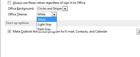
Okay, there are two other themes you can choose, Light Gray and Dark Gray, but that does really not solve the problem. In older versions of Office, we also had the possibility to choose Black, Silver or Blue, but that is for some reason no longer an option.
How to change color Theme in Office 2013
If you want to change to one of the gray themes, here is how it is done. It does help a little I think:
- Click File > Office Account (or File > Account)
- Select the Office Theme you want from the dropdown list
I went to Microsoft own TechNet forum to see what solutions there was available for all the people that would like another theme with some colors or maybe just a darker theme. I did not found a solution, but look what I found instead:
Question about Office 2013 Theme:
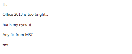
Answer from Microsoft TechNet Community Support:
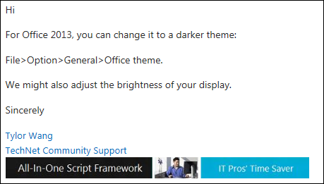
The guy is asking for another color theme because it is too bright and the answer is to adjust brightness of the monitor..!! That is just bad customer service if you ask me. Why not listen to your customers and try to give them what they want, if it is in your power? I have found so many people asking for this all over the Internet. We are not asking you to redesign your Office logo. We are not asking for to change the default theme in your Office distribution. All we are asking for is to be able to download or design a theme with a little bit of colors. Is that really too much to ask for Microsoft?
Outlook 2013 Logo change from Yellow to Blue
Another thing that has changed is the color of the Outlook icon. After many years with a yellow Outlook icon, the Office theme has changed it a blue icon for some reason.
![]()

What people things about the new Office 2013 Design
I have found some quotes from people’s reaction to the new design of Office 2013:
“Office 2013 is much too bright & white”
“Did the Adams Family design the Office 2013…?”
“Everything looks so flat and dead. I’m working with these tools all day long…and it’s like I’m living in a Twilight Zone episode”
“Worst design – ever! The 1950’s called and they want their Office back”
“Is it me or is office 2013 meant to make eyes bleed?”
What do you think about the new design of Office 2013?
Please let me know what you think about the new design and the fact that there is no way to select a theme with some colors? Please drop me a comment below.


Microsoft should focus on user cool display for viewing experience. After all we love Microsoft their software products which help in easy & cool UI experience.
We want Crystal clear things not over brightening graphics in Office. Office is not tool which will be used for 1-2 minutes, It is tool for doing various task may take upto hours in completion. So it should be cool viewing for us.
I really think that Microsoft has failed with this one, but I also think that they can easily fix it if they want to.
Very much true. I have Office 2013 in my laptop, but I like Office 2010 in my office system. I never liked the new UI of 2013, it has a bit of learning curve for regular users also.
I do not think that it is that different to use compared to Office 2010, but oh boy do I wish for a theme that is not as bright as the three themes built-in to the new release.
Well I really like MS office 2013, as the cool features such as amazing animation, cloud storage and back up, pretty fast. Just some graphic issue, it isn’t that bad.
I do like the features of Office 2013 too. It is a great set of programs, but I can’t understand why we can get the option to change the theme to something a bit darker and more relaxing for our eyes.
Hi Thomas, I haven’t actually seen Office 2013 yet and now I’m afraid to. I don’t want my eyes to bleed!
Perhaps the next update to Office will address these issues, whether or not Microsoft will admit to the problem.
I haven’t moved to Office 2013 because of the subscription pricing. I prefer to pay once for software not multiple times.
Hi Carolyn
Microsoft Office is a pricy package. I you are happy with your current version I think you should stick with that one 🙂
It seems to be these days that developers want every one to damage their eyes, may be they have a secret firm that sells eyewear after lol.
I really don’t understand why it all has to be so damn bright and white. It is not just Microsoft. Google and Apple themes to do the same, but in Gmail at least I have the possibility to change the theme do something darker. That is pretty much all I ask of Microsoft. Give us some darker, colorful themes to choose from..!
Ack! Too much brightness is a no-no for me. Good thing I haven’t made the change yet. Guess I’m sticking to Office 2010
Office 2010 is still a great set of applications. No need to upgrade if you are happy with Office 2010
I don’t like high brightness in my office workshop. Because I am not comfortable with it though I love light gray.
Hi Alysha
The light gray helps a little, but I still think it is very bright.
It wouldn’t surprise me if they never fixed this. I have found as of late that a few of the big companies are playing deaf ear to what their customers want. I think this will only hurt them in the long run as they lose people’s trust.
I am afraid you could be right about this one Pau. Microsoft should listen more to their customers and admit if they have made something their customers do not like.
Hello Thomas, If I was the Developer of Microsoft Office then I definitely change the brightness.
..or at least just make a couple of extra themes that people could choose from. That is pretty much all people are asking for.
Hello Thomas,
I use this software I found many new thing but the design and look of office 2013 is very bright. I am agreed with you I also experience the same problem.
awesome post with good information and well written.Thanks for sharing.
I agree, in my office I am being forced to use this too bright useless Office 2013. MS guys/management, is it that hard for you to release a darker theme? Its been over one year, nothing has been done! CRAZY!
Oh i didn’t know there were different themes you could change it to! That is great! I would love to use a smaller colored theme. Thanks for putting this up!